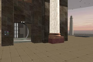
After researching reference photos of the Jedi Temple, I decided to completely change our CG model. I was originally going for the "used universe" look that "Star Wars" is known for, but I realized that the Jedi Temple model looked like a lot of our other digital sets.
I wanted to give the Jedi Temple a more distinctive look, so I went with an elegant, majestic look. For example, here's a reference photo of a Jedi Temple (NOT the one on Coruscant, but a Jedi Temple nonetheless):

I paid particular attention to the huge statues, brickwork, columns, and tile, as can be seen in the following before-and-after picture of our model:


Hard to believe that's the exact same camera angle, right? About the only thing that's the same is the door and interior detail.
As you can see, I made the Jedi Temple much taller to make it more majestic and palace-like. I also added the huge statue, brickwork, columns, and tile, as inspired by the reference photo above, as well as the statue in the following reference photo of the Jedi Temple interior:

Unfortunately, the taller building blocked the view of the distinctive Jedi Temple spire. I wanted to keep the Jedi Temple spires visible so that the audience could easily identify this location as the Jedi Temple, so here's another before-and-after picture showing the new location of the Jedi Temple spire:


Again, hard to believe it's the same camera angle, right?
This is still a work-in-progress, so that's why the background image of the skyline is crappy (I moved it farther away, but didn't increase its height, which is why it's cut-off at the top).
Since I moved the Jedi Temple spires, I used a "Star Wars" reference photo for the new location. Here's a reference photo side-by-side with roughly the same camera angle on our model:


The reference photo is from the "Star Wars: The Force Unleashed" video game. I haven't finished this model, so the texture maps, geometry, traffic, and background are still temporary. However, you can see that I put actual 3D buildings in for the Coruscant cityscape, rather than the old temporary photo (as seen in the following photo):

This isn't the same camera angle, but it's close enough and at least you can see the old (temporary) background image.
Here's the final before-and-after comparison:


Big difference, huh?
I'm still working on this model, so these are photos of a work-in-progress. The final model will probably look significantly different. Still, I think this is a step in the right direction, as opposed to the previous "used universe" look that I was going for.
Later,
Bob

Wow, those are major changes! I'm looking forward to seeing more.
ReplyDelete