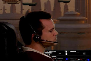
Fortunately, we only shot Jedi starfighter cockpit scenes, so we didn't need much space. But we'll have to figure out what to do with all the furniture before next Sat. when we shoot Brad's other scenes.
Although we had a cramped set, we did find a super cool "cockpit panel" for Brad to interact with:

Of course, the Vita Mix "cockpit panel" will never appear on-screen, but it helps Brad deliver a more realistic performance. Gotta love guerrilla film making! :D
Jen also came over for a costume fitting:


The 1st picture is the original Yane costume. However, since that costume was originally fitted for Katinka (who's tiny), the blue outer dress required some modifications to fit Jen properly.
Instead of modifying the blue outer dress, we considered other options. One example is Kali's vest (which Kali wore as one of Bibble the Hutt's girlfriends) over the under dress (middle picture). However, we felt it resembled Brad's costume too much, so we nixed that idea.
We finally settled on a blue velvet sash with the knotted belt (3rd picture). It combines the color scheme from the original Yane costume with a more "Star Wars"-like, Tattooine-ish look.
Anyway, back to live footage. We shot 19 Jedi Starfighter cockpit scenes, but they all start to look the same after a while. So rather than bore you with a bunch of similar pictures, here are just a few before-and-after comparisons:


This is Brad flying over the Coruscant cityscape. Not only is Brad wearing his new costume (notice the dark tabards), but we also added a headset and I improved the Coruscant cityscape background.
Here's a before-and-after comparison of the Coruscant cityscape background WITHOUT Brad's humongous head in the way :D


HUGE difference, right? Funny how proud I was of our old Coruscant cityscape a year or two ago. Now it just looks amateur and retarded.
Here's a reference picture from "Star Wars: The Phantom Menace" so that you can compare it to our new-and-improved scene:

Even though the sky is blue in the reference picture and ours is orange, I think you'll agree our new background looks more "Star Wars"-y.
I'm also going to improve the Jedi Starfighter's interior texture maps one of these days. Again, I was proud of myself a few years ago when I created the current texture mapping, but now that I have a better idea of what I'm doing, I know they can look MUCH better.
Here's another before-and-after comparison:


This scene is after Brad leaves the Jedi Temple as he escapes from the pursuing Clone Troopers. In addition to improving the background, I also fixed those streams of traffic so they match the actual "Star Wars" movies better.
Here's another major improvement -- from an original animatic using a CG Stormtrooper stand-in for Brad, to the new-and-improved shot using live footage:


Hard to believe it's the same shot, right? In the "before" picture, I hadn't added the Jedi Starfighter cockpit "interior" model to the "exterior" model (they're 2 separate models). That's why you can see through the walls and see R7's head, the wings, an engine, and the Coruscant spaceport background in the "before" picture.
In the "after" picture, the only thing you can still see in this scene is the Coruscant spaceport background in the top-right part of the shot. Other than that, they almost look like 2 completely different shots!
That's it for now. We're shooting again next Sat., so I have to build some props, prepare the shot list, etc. If I have time, I'm also going to retrofit some of our old Coruscant scenes because they no longer match the new-and-improved look.
Later,
Bob

Wow seriously, these before and after pictures lit a fire in me again on the excitement. I'm really not kidding when I say the new backgrounds and stuff look REALLY professional. Excellent job =)
ReplyDeleteI remember when we were trying to get the Coruscant city scape to look right a while back. These are HUGE improvements and I agree with Sarah that they're professional quality. Great job Bob!
ReplyDelete