6/21/10

Jedi Starfighter Cockpit and Imperial Star Destroyer

Brad and his friend, Jim, have completed the framework for our Jedi Starfighter cockpit! This will probably be the only real set we have in this entire movie (all of the other sets are CG models).

Here's a picture of the Jedi Starfighter:

And here are pictures of our Jedi Starfighter cockpit:

Of course, it still needs painting and detailing (hoses, switches, lights, etc.), but it still looks amazing.

Here are screenshots from our current animatic, which show the CG version of our Jedi Starfighter cockpit:


Hopefully you can use your imagination and replace all of those CG backgrounds with our real-life cockpit and visualize how awesome the final footage will look. I can't wait to film it!

On the CG-side, I added specular maps to some of our spaceships. Here are before-and-after comparisons of the Imperial Star Destroyer, as an example:

It's hard to tell at first glance, but there's more shininess on the bottom-right of the "after" picture.

Here's another before-and-after comparison:

Again, it's hard to tell but there's shininess in the "after" picture. You can see it especially well if you look at the gun turret on the bottom-left of the picture.

I was re-rendering our Bibble's Bar backgrounds and realized that I should model a "real" pad for him (and his 3 girlfriends) to sit on, so I'm currently in the middle of that. I'll include pictures in the next blog post.

Later,
Bob

6/13/10

Improved Texture Maps in Bibble's Bar

I just finished the latest improvements to Bibble's Bar. Here are some before-and-after comparisons:

This is Yane's view of the bar from the top of the stairs, when she first enters:

This gives a quick overview of some of the changes I made:
- The temporary images on the 1st and 3rd holopanels were replaced with video images. (If you're a "Star Trek" fan, you may notice that I borrowed their LCARS displays (which I got from the awesome website www.lcarscom.net)).
- The color scheme changed from the original grey to a more earthy brown.
- The flooring was changed to multi-colored stones to make it look more earthy.
- There's a trash can (set dressing) at the bottom of the stairs on the left. It's one of those little details that helps make the bar seem more real.
- Most of the surfaces have shininess, bumpiness, and reflections added, all of which create a more realistic, 3D look. You can't really tell in these compressed images, but you'll probably notice in the close-ups that follow.

Here's a close-up of the Kel Dorian Pilot and Bounty Hunter (represented by temporary placeholders) playing the holographic arcade game:

I made the yellow and orange lights on the holopanel (in the background) glow slightly. I also improved the texture map on the sides of the chess pedestal, giving it a metallic look rather than the old, grey, fake look.

Here's a close-up showing the seats and walls:

Aside from the change in the camera position, hopefully you can see that the shininess, bumpiness, and reflections in the "after" picture make it look much more 3D and realistic. If not, please don't tell me... I'll cry. :(

Here's another close-up. This is the entrance to the bar. The blast door is on the right.

Again, it's hard to see in these small, compressed images, but hopefully the shininess, bumpiness, and reflections make the "after" picture look more real.

Here's the final before-and-after comparison:

Not much to say here that I haven't already mentioned above, but hopefully the overall impression is that the "after" image looks a lot more realistic.

Not sure what I'm going to focus on next. Re-texture-mapping is very time-consuming, especially on a model this big. I guess you guys will just have to wait for the next blog post to find out...

Later,
Bob

4/23/10

Improved Star Destroyer Bridge

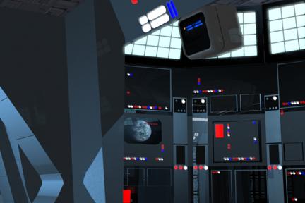
As part of the ongoing process of improving texture maps, I just finished the Star Destroyer Bridge model. Here are a bunch of before-and-after comparisons:

Although it's hard to tell in these compressed images, I improved the lighting, made many of the lights (especially in the pit area) "bright," and made the textures more-accurately match the "Star Wars" movies.

Here's another comparison, this time between a reference photo from "The Empire Strikes Back" (1st picture, below) and the latest version of our Star Destroyer Bridge (2nd picture, below -- it's the same picture as above, but I included it again here for an easier side-by-side comparison):

Again, it's hard to see details in these compressed images -- it's a lot better seeing full-size images. But overall, hopefully our new-and-improved model looks more 3D and realistic.

Here are before-and-after comparisons of the alcove part of the bridge:

Again, it's hard to see the changes in these compressed images, but hopefully the "after" picture looks more 3D. If you look carefully at the surfaces, especially the door detailing and the long, vertical, chrome panels on the upper-right side of the screen, you can see them reflecting other parts of the bridge. Most of the other surfaces have some degree of reflection as well, but it's hard to see in this picture.

I also improved the detailing on the control panel (right side of the picture). Before, it was just a picture of random controls, but now there are actual, 3D controls on the panel. The reason is because we have close-up shots that required more detailed surfaces. For example:

In the old version the blue and white buttons on the bottom-right of the picture were just low-resolution pictures, but in the new version they're actual 3D buttons. I also replaced those yellow lights with blue lights, since reference photos from the "Star Wars" movies showed that Imperial Star Destroyer bridges do NOT have yellow lights -- they're only red, white, and blue.

Here's that same alcove, from a different angle:

Without going into details, hopefully the general sense you get from looking at the 2 pictures is that the "after" picture looks more 3D and realistic, whereas the "before" picture looks more CG and fake.

Here's another comparison of a different part of the alcove:

Again, if you look at the surfaces, you can see that most of them are reflective to some degree. You can see it particularly well if you look at the monitor on the top-right of the picture, the screen showing the planet in the middle of the picture, and those long, vertical, chrome panels on the bottom-right of the picture.

Here's a different part of the Star Destroyer bridge:
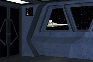
Here's where you can really see the difference in the texture mapping on the walls. If you look at this reference picture from "The Empire Strikes Back" (it's the same part of the bridge as above, but from a different angle), you can see that the walls have a fairly flat appearance, not all bumpy and panel-y like in our "before" picture, above.

You can also see the glass that I added to our windows (picture, above), which may have been included in a previous blog post -- I can't remember.

Here's the last before-and-after comparison, from the same part of the bridge, but looking to the right in a close-up:
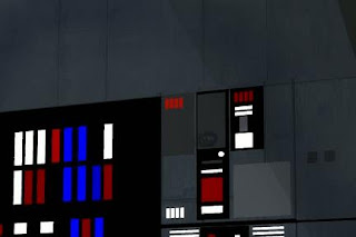
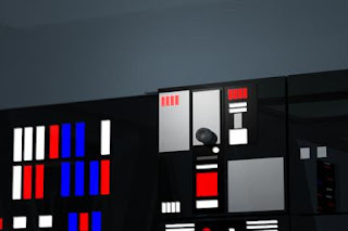
Same as before -- flatter, non-panely walls and more reflective surfaces (look especially at the bottom-right of the picture -- you can see the other part of the bridge reflected in the black panel).

I think my next challenge will be improving the texture maps in Bibble's Bar. However, it may be a few weeks before my next post because texture mapping is VERY time-consuming so I don't know how long it will take...

Later,
Bob

3/25/10

Improved Dantooine Backgrounds, continued

Sarah finally finished Yane's peasant costume! YAY!!! Now all we need is the skirt for Yane's Royal Palace costume and we'll be ready to get Jen over here to shoot her footage! I can't wait!

On the CG side, I finished improving all of our Dantooine backgrounds. As mentioned previously, I replaced as many of our CG background buildings with high-resolution digital pictures of Matmata, Tunisia, which is the actual location where George Lucas shot the Tatooine scenes for "Star Wars."

Speaking of which, even though our script places these scenes on Dantooine (which we did deliberately so that it would tie into "Star Wars" when they mention that the Rebel Alliance had a base on Dantooine), we decided to make it look like Tatooine. Now that we're using Matmata for our backgrounds, I'm strongly considering changing our script and relocating everything that happens on Dantooine onto Tatooine instead. It just makes more sense, but I'll have to review our script to make sure this change won't cause any problems.

Anyway, here's a before-and-after comparison of Scene I510a, which shows Yane walking down Garm St. on Dantooine:

The 1st picture shows our old animatic with Katinka walking down our CG model of Garm St.
The 2nd picture shows our new-and-improved animatic with our Yane stand-in walking down our more-realistic-looking Garm St. Of course, the final shot will include background extras and perhaps more set dressing.

By the way, the 2nd picture (above) is my 2nd version of the new-and-improved shot. Here's the 1st version that I ended up discarding:

I like this one too, but the 2nd version (the one we'll probably end up using), makes Garm St. look bigger and more spacious to me. But maybe that's just me. If anyone thinks the 1st version looks better, let me know and maybe we'll use that one.

Here's a before-and-after comparison of Scene I541 when Yane leaves Bibble's Bar:

In the 1st picture, the Stormtrooper is a "size reference" stand-in for Yane, and the background is completely devoid of any detailing (buildings, moisture vaporators, etc.).

In the 2nd picture, I left out the Yane "size reference" so that you can see all the new details: background buildings, landspeeder, R5 droid, and even a couple Nuna walking around!

Of course, I always go through a couple versions before settling on the final one that I think looks best. Here's an example of a version that didn't make it:

This is exactly the same as the final version, shown above, except it's missing the R5 droid. It seems like a simple change, but the scene seems to lose its "life" without a droid. Somehow R5 gives the scene more life -- at least that's how it feels to me.

Here's the final before-and-after comparison. This one shows Scene I542 when Yane runs around the corner (on the right) and spots the Stormtroopers escorting Ryke from the Med Center:

WAAAYYYY better, right? I even re-texture-mapped the foreground wall (on the right) to match the appearance of the buildings in the background. Of course, this isn't final -- I still have to add color correction so that all of the backgrounds match, plus add live extras and other details. But at least it's a huge improvement over our previous animatic!

Later,
Bob

3/20/10

Improved Dantooine Backgrounds

I've been re-evaluating many of our digital sets, looking for areas of improvement. One huge breakthrough I had a few months ago was the use of matte paintings instead of 3D models in the background. Not only do they look better, but they also result in smaller file sizes and faster rendering times.

Here's the most recent improvement, Scene I510b when the Imperial Sympathizer spots Yane on Dantooine:

Much better, right? The new-and-improved version still isn't done -- I'm going to improve texture maps, lighting, color-correction, etc. But even this rough version gives you an idea how much better the new background looks.

I'll continue improving backgrounds on other digital sets, so stay tuned!

Later,
Bob

3/12/10

Improved Fire and Smoke, Part 3

I replaced the old CG fire and CG smoke with composited fire and smoke. Here are before-and-after comparisons of Scene H328, which is after the Stormtroopers have massacred the Carinda family (represented by the CG Stormtrooper stand-ins lying on the ground on the bottom-left):


And here's a close-up comparison (Scene H329):


You can't really tell in these pictures, but I also added a flickering light to the doors and windows that are "on fire." This helps blend the 2 different layers and makes them look like the flames from the composited fire are illuminating the CG model.

Later,
Bob