
There's no easy way to say this, but unfortunately this project is dead. :(
My laptop had a catastrophic hard disk failure last week and I lost all of the files for this project -- the raw video, the edited video, the 3D models, the recorded audio, the music, EVERYTHING!
Although I perform weekly backups, I didn't include these files in my backups simply because there was too much data. I didn't have enough space on my backup hard drive to include these files. Of course, in retrospect, it would have been well worth the money to invest a couple hundred bucks in a huge backup drive. But hindsight being 20/20, that bad decision resulted in the loss of gigs of data representing thousands of hours of hard work.
Maybe if I'm lucky I'll stumble across a copy of the animatic buried somewhere and upload that so at least we have something to show for our efforts. Otherwise, this blog is the only record we have of all of that hard work.
Bob
9/17/12
7/8/12
Taking a short break...
As you can probably tell from the lack of posts recently, I'm taking a short break right now.
I'm the only one working on this project right now, and it's pretty much been that way for the past few years, so every year or so I get a little burned out.
After recharging my batteries, I'll jump back on this project and resume updating this blog.
Thanks,
Bob
I'm the only one working on this project right now, and it's pretty much been that way for the past few years, so every year or so I get a little burned out.
After recharging my batteries, I'll jump back on this project and resume updating this blog.
Thanks,
Bob
6/10/12
Improved Coruscant Spaceport, continued
I've been busy lately with graduations, parties, etc., so I only have a minor change to the Coruscant Spaceport.
After consolidating the different shots into a single CGI model, there were some problems. One of those problems was the fact that the matte painting I'm using for the background wasn't tall enough to fill the sky in the shot of the Jedi Starfighter landing:
 The red arrow shows the seam between the top of matte painting #1 (the Coruscant skyline) and the bottom of matte painting #2 (the Coruscant sky).
Of course, we couldn't live with such an obvious flaw in the shot, so I extended the sky on matte painting #1:

Yay -- no more seam!
Hopefully I'll have more time to work on the movie in the near future...
Later,
Bob
5/27/12
Improved Coruscant Spaceport
Great... Google changed their interface, so now my text formatting is screwed up and I can't
figure out how to display the pictures side-by-side anymore. What a pain...
Anyway, after consolidating most of the scenes at the Coruscant Spaceport into a single 3ds file, I improved some texture maps to make the model look more realistic.
Here's a before-and-after comparison of Scene B102b when the Jedi Fighter lands at the Coruscant Spaceport:


Admittedly, the changes are minor -- I made the buildings shinier and I made those crane things (immediately below the Jedi Starfighter, and also in the background on the bottom-left third of the screen) rusty. Small improvements, but I still think they make the scene look more realistic.
Here's another before-and-after comparison, with a more obvious change:

I hid the Jedi Starfighter in the "after" picture, just so that I could see the ground and background more clearly. Aside from that temporary change:

- I changed the ground to look more realistic.
- I removed that concept Jedi Starfighter from the background -- it seemed like it made the scene too busy.
- I replaced some of the boxes with more detailed and realistic-looking boxes.
- I changed the background sky image from the smoking Jedi Temple (which wasn't tall enough to fill the screen) to the new Coruscant skyline.
There will undoubtedly be more improvements in the future, but that's it for now.
Later,
Bob
5/13/12
Still Working, Despite the Silence...
Wow... it's hard to believe it's been a month since my last update.
Despite the lack of posts, I have been working on the movie as time permits. Unfortunately, the work I'm doing right now doesn't lend itself to pictures.
Back when we created the animatic, I often split a CG model into separate files for each scene. For example, if there were 5 scenes at the Coruscant Spaceport, I split the Coruscant Spaceport model into 5 separate files so that each file could focus on the elements necessary for that scene (lighting, background, etc.). The benefit was smaller file sizes that reduced the frequency of 3DS crashing, and faster render times (since I deleted unnecessary geometry). The downside was that changes to one model (ex: improving texture maps) didn't propagate to the other scenes.
So... right now I'm consolidating all of the different versions of each model into a single "master" CG model. For example, right now I'm consolidating all of the different Coruscant Spaceport scenes into a single "Coruscant Spaceport" file. That way, when I make improvements in the future (like texture maps), those improvements will be reflected in all scenes at the Coruscant Spaceport.
It's very tedious and time-consuming, so I don't know how long it will take. However, the hard work will be worth it because when I'm done consolidating the models, I'm going to resume improving the mdoels (primarily texture maps) to give us the photorealistic imagery we want.
Later,
Bob
4/15/12
Possible Improvement
I keep watching our animatic looking for areas that can be improved. One of the scenes that stuck out recently was when Ryke drops a cargo container on a bunch of Stormtroopers in the Star Destroyer hangar.
Even though the cargo container model we used is from the "Star Wars" universe, I thought it might look better if we dropped a more iconic Star Wars object on the Stormtroopers.
So... I replaced the cargo container with a TIE fighter. Here are comparison shots:


I had to change the camera angle because Ryke dislodges the object by shooting it with a blaster, and if I kept the old camera angle, you wouldn't be able to see the blaster bolts knocking the TIE fighter loose because the TIE fighter's wing blocked the view.
BTW, if we decide to keep this change, I may add more TIE fighters hanging behind this one.
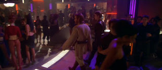
And yes, I made sure that they DO have TIE fighters hanging in the Star Destroyer hangar. Here's a reference picture from "Return of the Jedi":

Here's another comparison, which is after the object has crushed the Stormtroopers:


Again, I had to change the camera angle a bit in the revised scene.
As much as I like the TIE fighter instead of the cargo container, my only concern is that it supposedly crushes 4 Stormtroopers beneath it. I'm not sure a TIE fighter is heavy enough to crush 4 Stormtroopers and still lie flat on the floor. A couple possible solutions are:
1) Cheat the size of the TIE fighter, making it larger and thus make it look heavier, and/or
2) Have the TIE fighter lying 6-12" off the floor, so it looks like the Stormtrooper bodies are keeping the TIE fighter's wing from lying completely flat on the floor.
What do you guys think? Do you like the TIE fighter better than the cargo container? If so, do you think I should make the TIE fighter bigger and/or a few inches off the ground?
Thanks,
Bob
Even though the cargo container model we used is from the "Star Wars" universe, I thought it might look better if we dropped a more iconic Star Wars object on the Stormtroopers.
So... I replaced the cargo container with a TIE fighter. Here are comparison shots:


I had to change the camera angle because Ryke dislodges the object by shooting it with a blaster, and if I kept the old camera angle, you wouldn't be able to see the blaster bolts knocking the TIE fighter loose because the TIE fighter's wing blocked the view.
BTW, if we decide to keep this change, I may add more TIE fighters hanging behind this one.
And yes, I made sure that they DO have TIE fighters hanging in the Star Destroyer hangar. Here's a reference picture from "Return of the Jedi":

Here's another comparison, which is after the object has crushed the Stormtroopers:


Again, I had to change the camera angle a bit in the revised scene.
As much as I like the TIE fighter instead of the cargo container, my only concern is that it supposedly crushes 4 Stormtroopers beneath it. I'm not sure a TIE fighter is heavy enough to crush 4 Stormtroopers and still lie flat on the floor. A couple possible solutions are:
1) Cheat the size of the TIE fighter, making it larger and thus make it look heavier, and/or
2) Have the TIE fighter lying 6-12" off the floor, so it looks like the Stormtrooper bodies are keeping the TIE fighter's wing from lying completely flat on the floor.
What do you guys think? Do you like the TIE fighter better than the cargo container? If so, do you think I should make the TIE fighter bigger and/or a few inches off the ground?
Thanks,
Bob
3/25/12
New-and-Improved Master Animatic
As you know, we've been gradually improving our CG models to provide photorealistic backgrounds for our live actors. However, for the most part, I have NOT updated our master animatic with the new material.
Believe it or not, our master animatic was last rendered on 7-8-10! That means we've had almost 2 years of improvements that weren't reflected in the master animatic.
Although I obviously can't post the updated animatic here (it's too big), here are a few before-and-after comparisons so you can get an idea of the improvements.
Scene C115b (Ryke Thale leaving the Jedi Temple after planting bombs in the databank):


Scene C115c (Close-up of Ryke Thale as he suspects something may be wrong):


Scene C115d (Moments before Ryke Thale's reaction to seeing droidekas behind the blast door):


Now imagine about half of the animatic looking as new-and-improved as the sample screenshots, above, and you'll get an idea of how much better the new master animatic looks. The entire movie has a different feel now -- much more like a realistic and immersive. It's pretty sweet!
Later,
Bob
3/11/12
Improved Med Center Exterior
If you recall from the 11/13/11 blog post, we recently changed the model for the med center exterior. As a result, I had to update some of the animatic scenes after Yane leaves Bibble's Bar.
Here are 2 before-and-after comparisons showing the old med center exterior and the new-and-improved med center exterior:


This is just a VERY rough draft. I didn't even bother to add Stormtrooper stand-ins in the new model. I'll definitely clean this up before the final version!
Aside from looking more Star Wars-like, I also think the new version is less cluttered. The Imperial shuttle is more prominent and it looks more imposing, rather than being dwarfed by the med center building.
Here's another scene showing a close-up:


Again, this is just a rough draft. I'll definitely fix the texture maps, etc. before the final version.
Later,
Bob
3/4/12
Improved Bibble's Bar Exterior
I realized that our CG model for the exterior of Bibble's Bar needed to be re-done. Even though it was kitbashed from Star Wars models (the Mustafar control room and a Mos Eisley building), it looked incongruent.
Here are before-and-after comparisons of the old model and the new model:


In the "before" picture (above, left), you can tell I basically took a piece of the Mustafar Control Room and stuck it on the front of a Mos Eisley building.
Here's a picture of the CG model for the Mustafar Control Room -- you can see the part I kitbashed for the old Bibble's Bar exterior in the back (those monitors with the yellow displays are the monitors with the red and blank displays in the old Bibble's Bar model):

Here's another before-and-after comparison from a different angle:


In the "before" picture (above, left), all you really see the Mustafar Control Room geometry.
In the "after" picture (above, right), you can see how the background looks a lot more Mos Eisley/Tatooine-like.
Here's the same "after" picture, but side-by-side against a reference photo from "Attack of the Clones" to compare the look and texture of the building:

I'll probably eventually replace that "garage door" with something better in the future, since we don't see any of that "garage door" stuff in the "Star Wars" movies. However, I just added it for now as a cheat since I didn't feel like figuring out what to put in that space (right now it's a big cut-out, like a garage).
Here's the last before-and-after comparison:


Bibble' Bar (right foreground) looks a lot more congruent with the building in the background in the "after" picture than in the "before" picture.
By the way, the building in the background is a photograph of an actual building in Tunisia (where they filmed the Mos Eisley scenes) -- it's not a CG model. You can see the seam between the picture and the CG model in the "before" picture (look at the sand -- it's one color/texture in the background photograph (behind the land speeder) and it's a different color/texture in the foreground). Here's that same background photograph all by itself:

Also, you may recall that our goal is to make our CG sets so photorealistic that they look like someone walked onto a real-life set and snapped a photo. We're getting closer with this model:

The 1st picture (above, left) shows the model rendered without the Yane stand-in and with "good" (i.e. ray-traced) shadows. You can see an example of the "good" shadows if you look at the top of the "garage door" and also if you look at the shadows cast by the moisture vaporator and nuna.
The 2nd picture (above, right) is the same picture (with the Yane stand-in and "quick" shadows) seen above -- I just re-pasted it here so that you can see them side-by-side for easier comparison.
We're getting there, slowly but surely...
Later,
Bob
Here are before-and-after comparisons of the old model and the new model:


In the "before" picture (above, left), you can tell I basically took a piece of the Mustafar Control Room and stuck it on the front of a Mos Eisley building.
Here's a picture of the CG model for the Mustafar Control Room -- you can see the part I kitbashed for the old Bibble's Bar exterior in the back (those monitors with the yellow displays are the monitors with the red and blank displays in the old Bibble's Bar model):

Here's another before-and-after comparison from a different angle:

In the "before" picture (above, left), all you really see the Mustafar Control Room geometry.
In the "after" picture (above, right), you can see how the background looks a lot more Mos Eisley/Tatooine-like.
Here's the same "after" picture, but side-by-side against a reference photo from "Attack of the Clones" to compare the look and texture of the building:

I'll probably eventually replace that "garage door" with something better in the future, since we don't see any of that "garage door" stuff in the "Star Wars" movies. However, I just added it for now as a cheat since I didn't feel like figuring out what to put in that space (right now it's a big cut-out, like a garage).
Here's the last before-and-after comparison:


Bibble' Bar (right foreground) looks a lot more congruent with the building in the background in the "after" picture than in the "before" picture.
By the way, the building in the background is a photograph of an actual building in Tunisia (where they filmed the Mos Eisley scenes) -- it's not a CG model. You can see the seam between the picture and the CG model in the "before" picture (look at the sand -- it's one color/texture in the background photograph (behind the land speeder) and it's a different color/texture in the foreground). Here's that same background photograph all by itself:

Also, you may recall that our goal is to make our CG sets so photorealistic that they look like someone walked onto a real-life set and snapped a photo. We're getting closer with this model:

The 1st picture (above, left) shows the model rendered without the Yane stand-in and with "good" (i.e. ray-traced) shadows. You can see an example of the "good" shadows if you look at the top of the "garage door" and also if you look at the shadows cast by the moisture vaporator and nuna.
The 2nd picture (above, right) is the same picture (with the Yane stand-in and "quick" shadows) seen above -- I just re-pasted it here so that you can see them side-by-side for easier comparison.
We're getting there, slowly but surely...
Later,
Bob
2/19/12
Improved Animatic Backgrounds for Bibble's Bar
After improving the CG model for Bibble's Bar, I started re-rendering some of the background plates for our animatic. It's been very time-consuming because a few months ago I moved all of the files for this project from my old PC to my laptop. As a result, there have been growing pains with missing plug-ins, missing video files, etc.
Anyway, here are a few before-and-after comparisons of the re-rendered scenes from Bibble's Bar:


You've seen this before-and-after comparison before:


You can barely tell in these compressed images, but the background in the scene above looks much more 3D and realistic than before. In fact, here's a bigger version of the "after" picture:

It's still a little hard to see, but the stucco on the walls looks more realistic, the TV in the background looks more realistic, and the cup and bottle in the foreground are new (though we may cheat those out of the final shot).
This one also looks much better when seen full-size:


It will look even better when we replace those 2 stand-ins with real actors.
This is probably the best example of the improved CG model for Bibble's bar:


Aside from the temporary stand-ins (Theresa, Wookiee, and bartender), I think this scene looks much more like a real bar and less like the fake CG bar in the old version.
I'm going to keep re-rendering the background plates for the Bibble's Bar scenes. I also decided to redo the exterior model for Bibble's Bar.
Later,
Bob
Anyway, here are a few before-and-after comparisons of the re-rendered scenes from Bibble's Bar:


You've seen this before-and-after comparison before:
- The stadium seats were removed.
- A bar and tables were added.
- The lighting was changed to green and purple.


You can barely tell in these compressed images, but the background in the scene above looks much more 3D and realistic than before. In fact, here's a bigger version of the "after" picture:

It's still a little hard to see, but the stucco on the walls looks more realistic, the TV in the background looks more realistic, and the cup and bottle in the foreground are new (though we may cheat those out of the final shot).
This one also looks much better when seen full-size:


It will look even better when we replace those 2 stand-ins with real actors.
This is probably the best example of the improved CG model for Bibble's bar:


Aside from the temporary stand-ins (Theresa, Wookiee, and bartender), I think this scene looks much more like a real bar and less like the fake CG bar in the old version.
I'm going to keep re-rendering the background plates for the Bibble's Bar scenes. I also decided to redo the exterior model for Bibble's Bar.
Later,
Bob
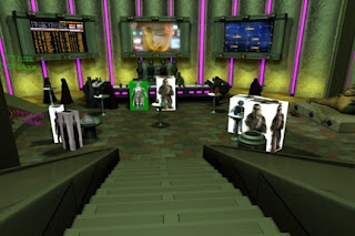
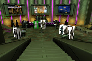
1/29/12
Bibble's Bar with New Lighting
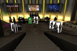
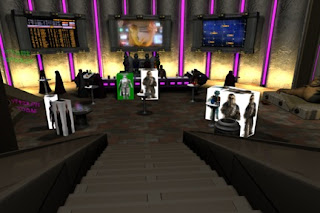
Looking at reference photos from "Attack of the Clones" and "Star Wars: The Old Republic," I realized that bars are very colorful:

So I experimented with different lighting combinations in Bibble's Bar. Just so you can see some of the trial-and-error that goes into this process, here are just a few of the lighting combinations I tried:
The first picture (above, left) is the original lighting.
In the second picture (above, right), I changed the yellow "neon" lights (on the walls and bar) to purple, just to see how it looked. It looked more like a bar to me, so I knew things were moving in the right direction.
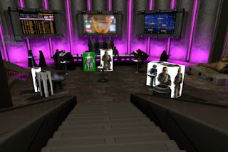
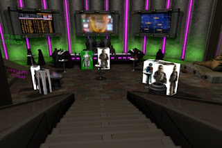
In the 2nd version (above, left), I changed the floor lights to purple too. That seemed like overkill, so I tried a 3rd version with green floor lights (above, right). Hmmm... not quite right so I tried changing the entire bar's lighting:
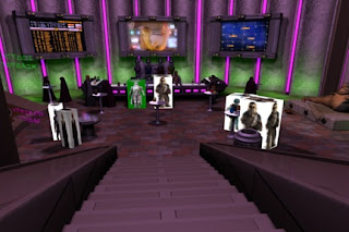
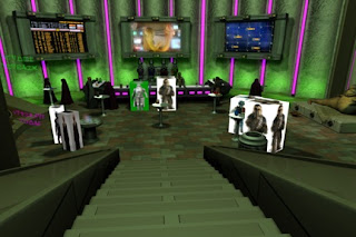
The 4th version (above, left) has purple overall lighting.
The 5th version (above, right) has green overall lighting.
It's kind of funny, because the "purple lighting" version looks a lot like the "Attack of the Clones" bar:
And the "green lighting" version looks a lot like the "Star Wars: The Old Republic" bar:
Personally, I liked the green lighting better, but it still didn't seem right. Here are 2 more color combinations:
In the 6th version (above, left), I changed the wall lights to yellow. The yellow lights don't really match the purple and green color scheme, so I changed it again.
In the 7th version (above, right), I changed the wall lights to orange. This is the version I like best. Just so you can see them side-by-side, here's the original lighting compared to the new lighting:
I think the new version looks a lot more bar-like and night clubby -- it just has more "atmosphere." Also, on a technical side, the green overall lighting means we can get away with green spill on sloppy chroma keys when we composite-in our live actors. :)
Now that Bibble's Bar is essentially finished -- at least for now -- I'm going to re-render the backgrounds for our animatic.
Later,
Bob


So I experimented with different lighting combinations in Bibble's Bar. Just so you can see some of the trial-and-error that goes into this process, here are just a few of the lighting combinations I tried:


The first picture (above, left) is the original lighting.
In the second picture (above, right), I changed the yellow "neon" lights (on the walls and bar) to purple, just to see how it looked. It looked more like a bar to me, so I knew things were moving in the right direction.


In the 2nd version (above, left), I changed the floor lights to purple too. That seemed like overkill, so I tried a 3rd version with green floor lights (above, right). Hmmm... not quite right so I tried changing the entire bar's lighting:


The 4th version (above, left) has purple overall lighting.
The 5th version (above, right) has green overall lighting.
It's kind of funny, because the "purple lighting" version looks a lot like the "Attack of the Clones" bar:
And the "green lighting" version looks a lot like the "Star Wars: The Old Republic" bar:
Personally, I liked the green lighting better, but it still didn't seem right. Here are 2 more color combinations:


In the 6th version (above, left), I changed the wall lights to yellow. The yellow lights don't really match the purple and green color scheme, so I changed it again.
In the 7th version (above, right), I changed the wall lights to orange. This is the version I like best. Just so you can see them side-by-side, here's the original lighting compared to the new lighting:
I think the new version looks a lot more bar-like and night clubby -- it just has more "atmosphere." Also, on a technical side, the green overall lighting means we can get away with green spill on sloppy chroma keys when we composite-in our live actors. :)
Now that Bibble's Bar is essentially finished -- at least for now -- I'm going to re-render the backgrounds for our animatic.
Later,
Bob
Subscribe to:
Posts (Atom)


